
Main Menu (Week 7 Update)
- Stylus Cat Studios

- Oct 18, 2019
- 1 min read
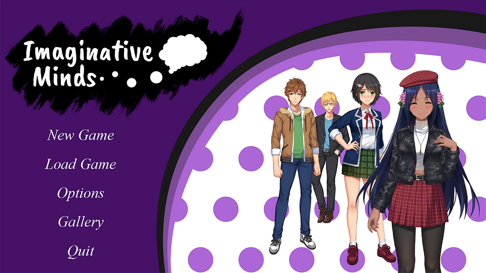
We have completed our Main Menu Screen along with our Visual Novel's Logo! It was quite challenging at the start as we had to decide the main font to from 5 choices. We decided to go with Caveat Brush as it looks playful, wild and attention-seeking which represents the overall feel of our Visual Novel. A thought bubble shaped slightly like a brain with black brushstrokes behind our title is to show the creative freedom the player can choose within the Visual Novel.
Now let's talk about the Main Menu! Christalle (#461268) is decided as the main colour as it resembles the closest colour to the School of Infocomm & Technology in Ngee Ann Polytechnic. The typography choice for the button is Times New Roman Italicized as we feel it feels very stylish and vibrant. Lastly, behind the characters, is a purple polka-dot background that slowly moves in a clockwise direction. This shows the generally go-lucky mood of the Visual Novel.
For next week, we will work on the Save Screen & Load Screen while improving our drafts of the characters and backgrounds. See you soon!
Paws Out!
18/10/2019
- Stylus Cat Studios


Comments